IBM


SUMMARY
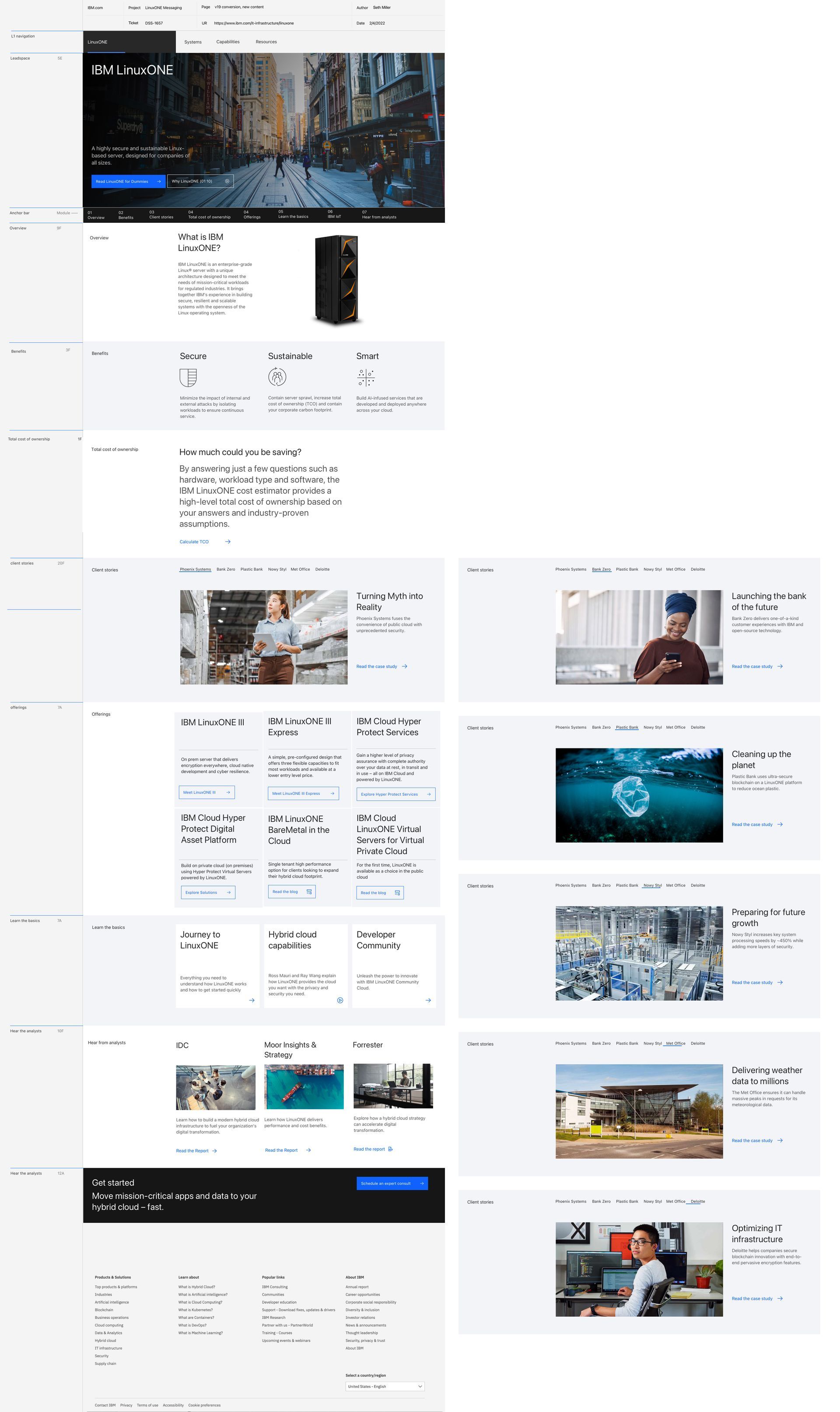
IBM LinuxONE is an enterprise-grade Linux® server with a unique architecture designed to meet the needs of mission-critical workloads for regulated industries. It brings together IBM’s experience in building secure, resilient and scalable systems with the openness of the Linux operating system.
CHALLENGE
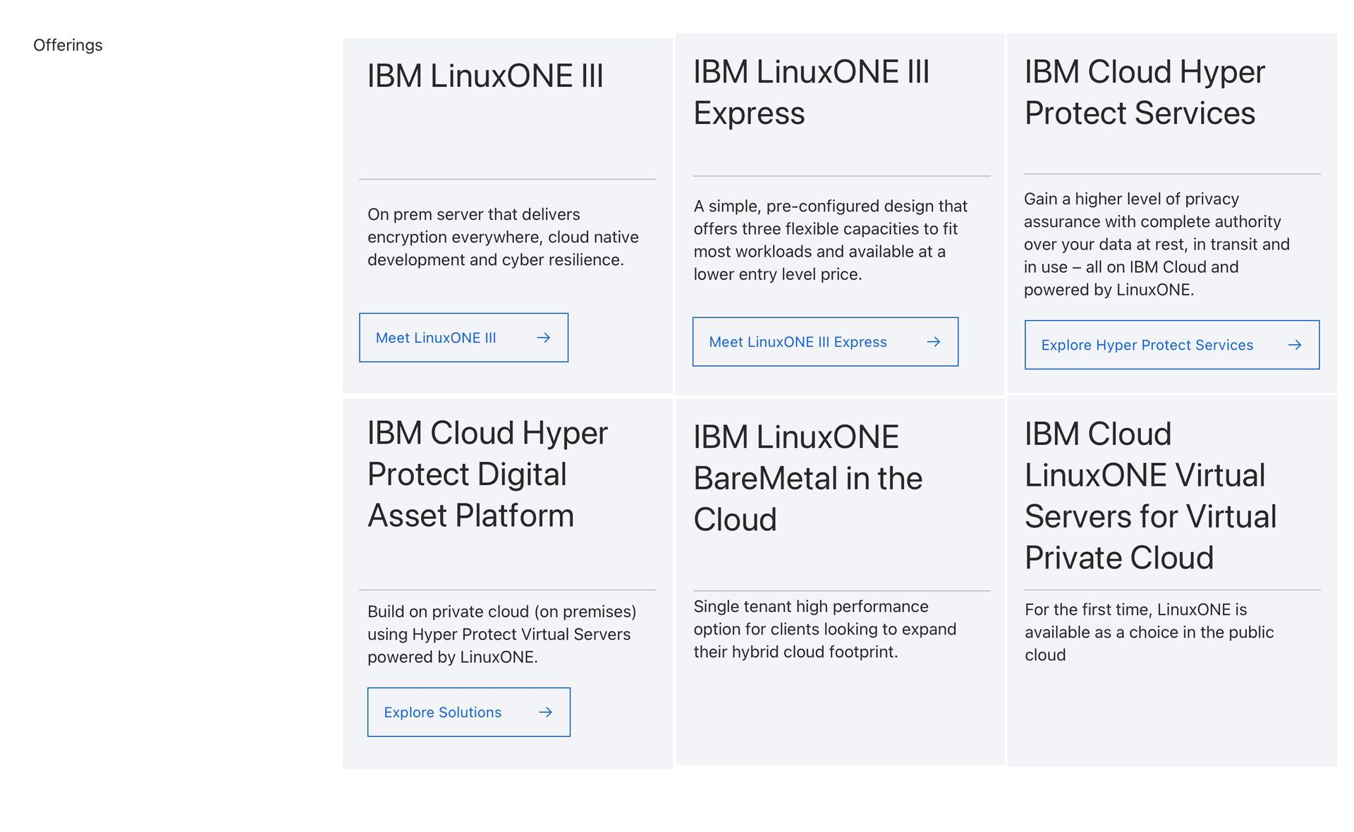
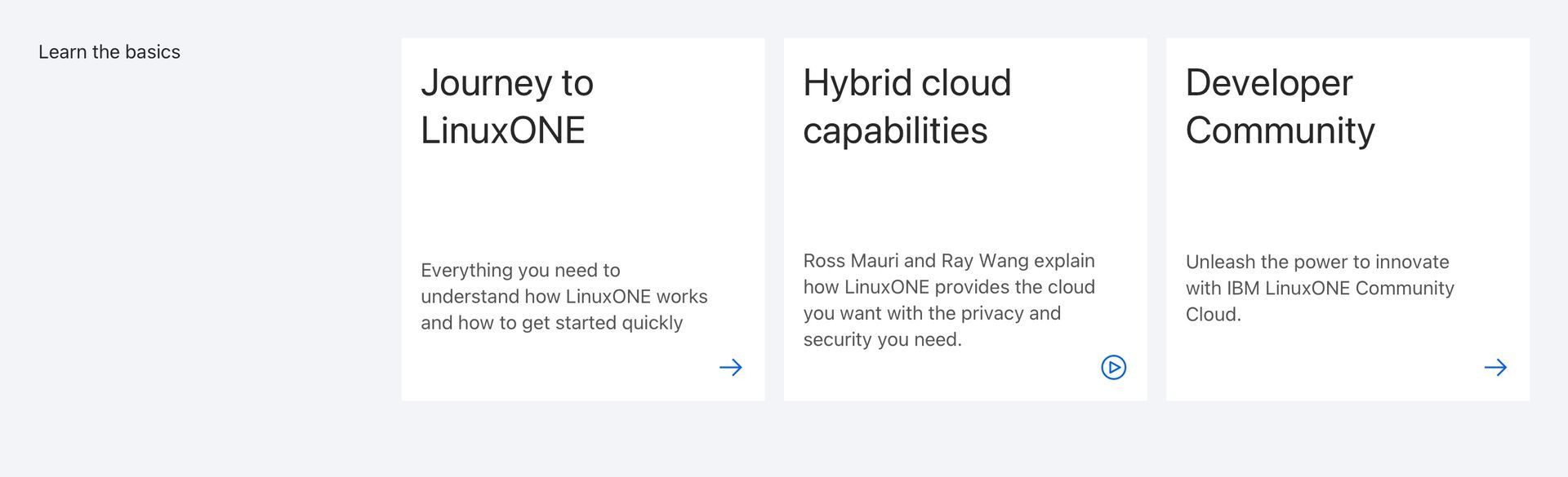
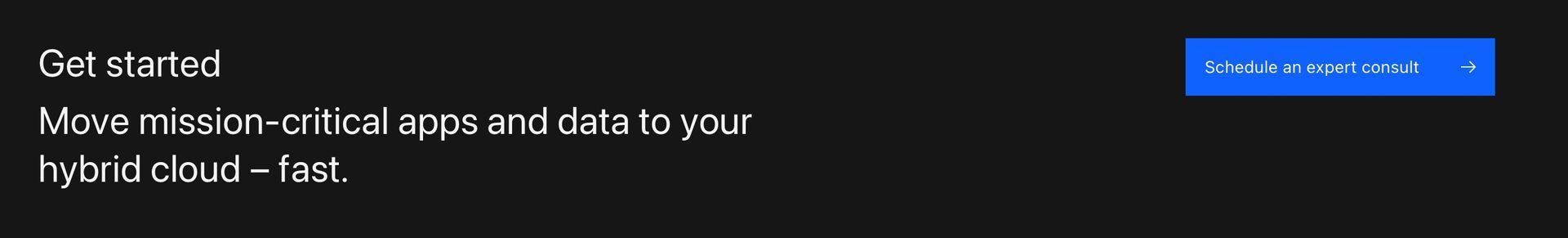
The primary challenge was to refresh the IBM LinuxONE webpage. We needed to redesign the detailed product page in a way that showcased where and how the product could be used. It needed to display its use in various markets, share case studies, show benefits of the product, and incorporate CTA's in the process.
REQUIREMENTS
• Meeting with client/product managers
• Wireframing
• Image/asset gathering
• UX/UI design
TOOLS
• Sketch
• Photoshop
• Illustrator
• Invision
• Drupal
SOLUTION
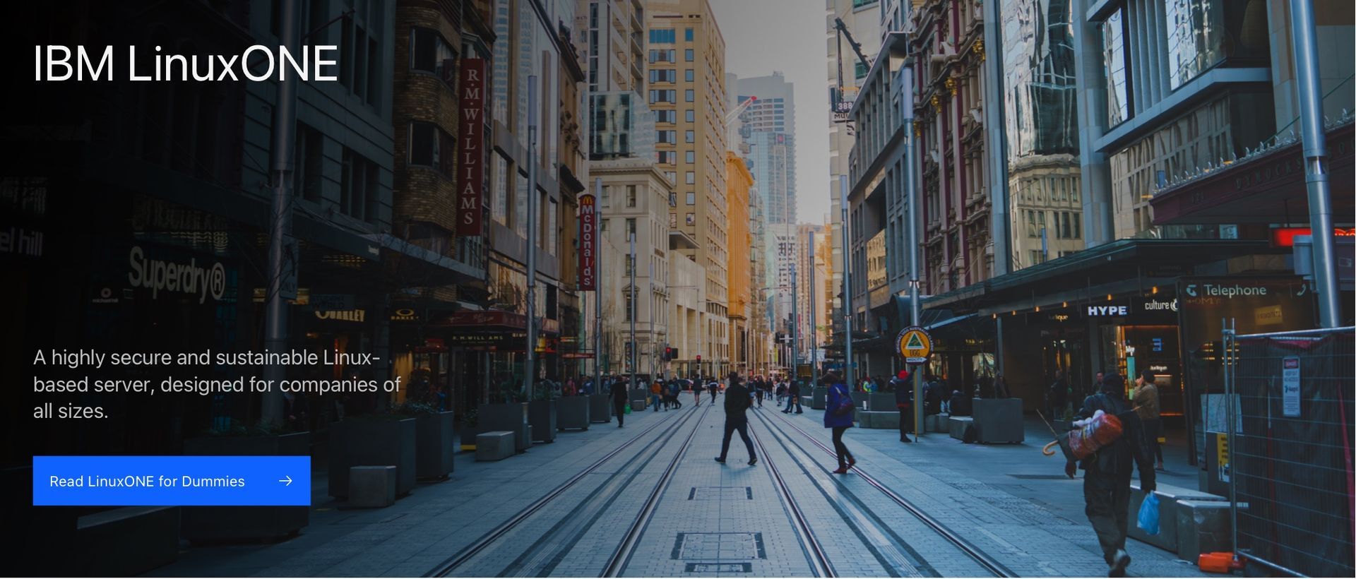
The leadspace on IBM pages significantly influences the overall page aesthetics. To create an engaging page, I chose an image depicting corporate businesses in an urban and youthful style, reflecting Linux's diversity and openness. The selected image showcased dynamic, independent individuals in a downtown setting, complemented by subtle orange tones (Linux server colors).
Moving on to the product presentation, I enhanced hardware images using Photoshop, isolating the product with a drop shadow for emphasis. This created a balanced and focused display, with ample space for accompanying text.
Considering IBM's diverse systems and methods, the remainder of the page involved UX/UI steps, aligning content with optimal components and adhering to IBM's best practices. This included creating wireframes, incorporating pictograms for product benefits, and carefully selecting high-quality imagery to enhance the overall professional feel of the page and related content.
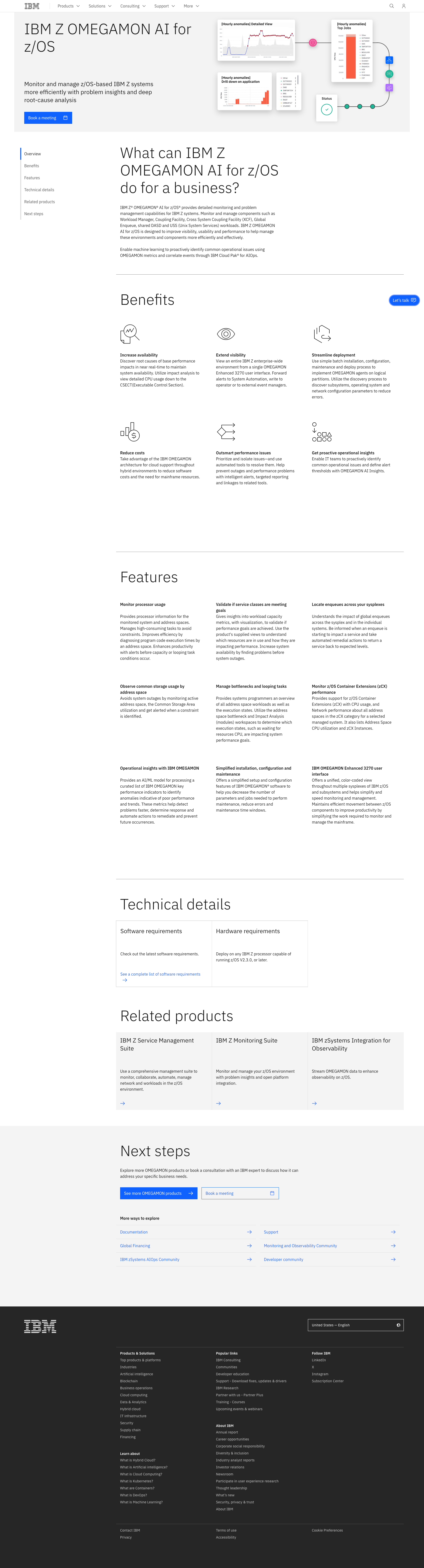
SUMMARY
IBM Z OMEGAMON provides detailed monitoring and problem management capabilities for IBM Z systems. It allows users to monitor and manage components such as Workload Manager, Coupling Facility, Cross System Coupling Facility (XCF), Global Enqueue, shared DASD and USS (Unix System Services) workloads. IBM Z OMEGAMON AI for z/OS is designed to improve visibility, usability and performance to help manage these environments and components more efficiently and effectively.
CHALLENGE
Redesign the pages and create leadspace images for the product pages. OMEGAMON was available to be used on different platforms, JVM, networks, and z/OS. That being said, there needed to be three different pages with three similar but different leadspaces to help create a visual difference between products and pages.
REQUIREMENTS
• Meeting with client/product managers
• Wireframing
• Image/asset gathering
• UX/UI design
• Illustration design
TOOLS
• Figma
• Illustrator
SOLUTION
After assessing what was needed through meeting with the client, we created a plan to update the pages. The pages were redesigned but focused on less image based work and was more content specific. The plan for these product pages was to focus on wireframing the pages, illustrating leadspaces, updating page components using the new web platform, and updating pictograms (icons).
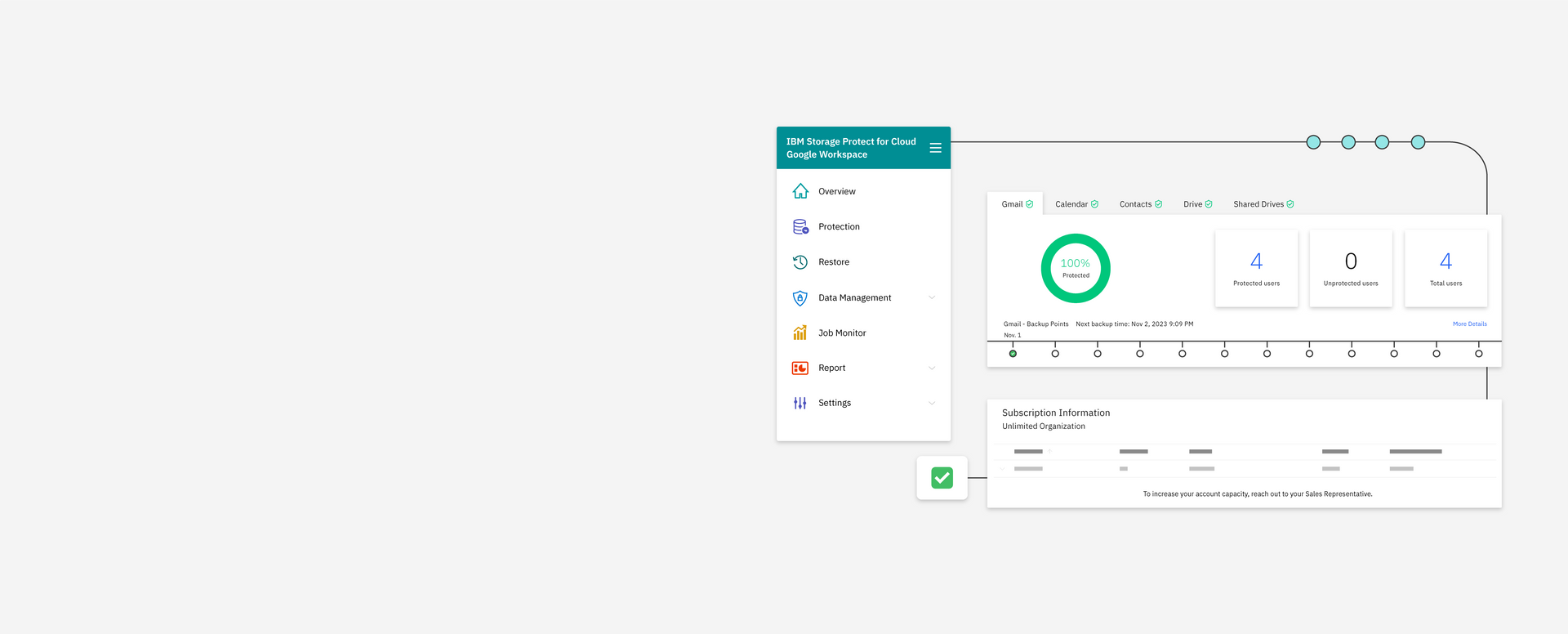
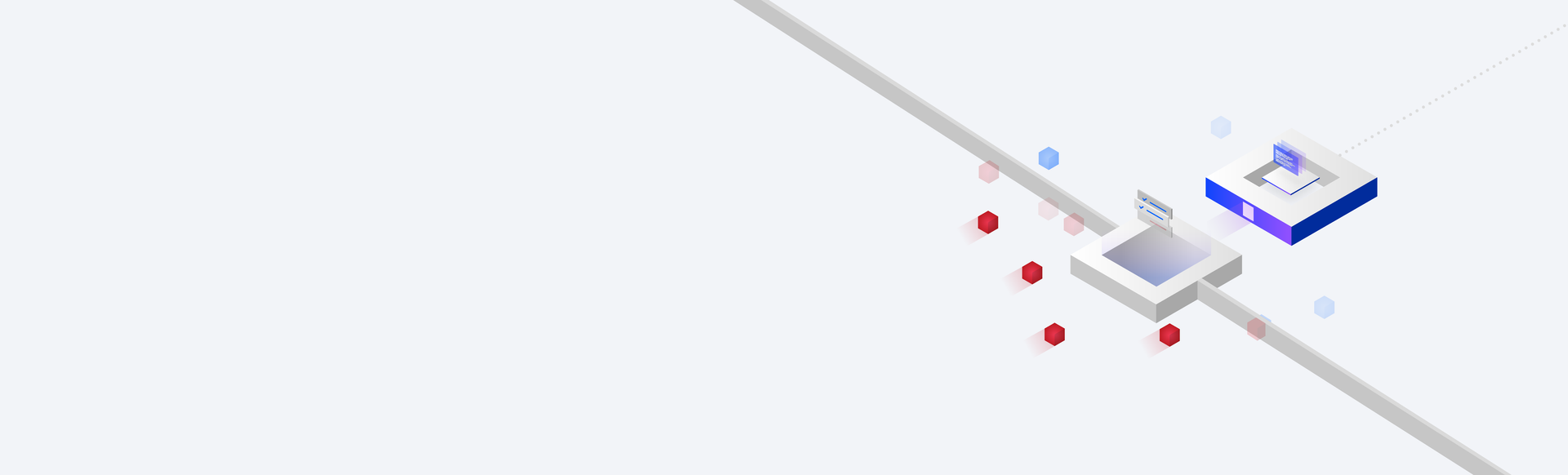
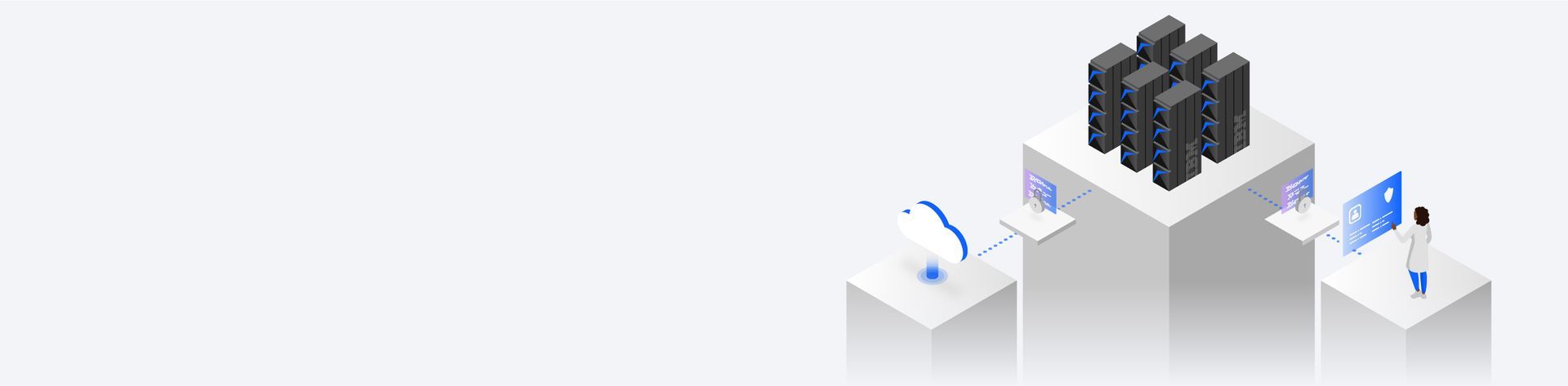
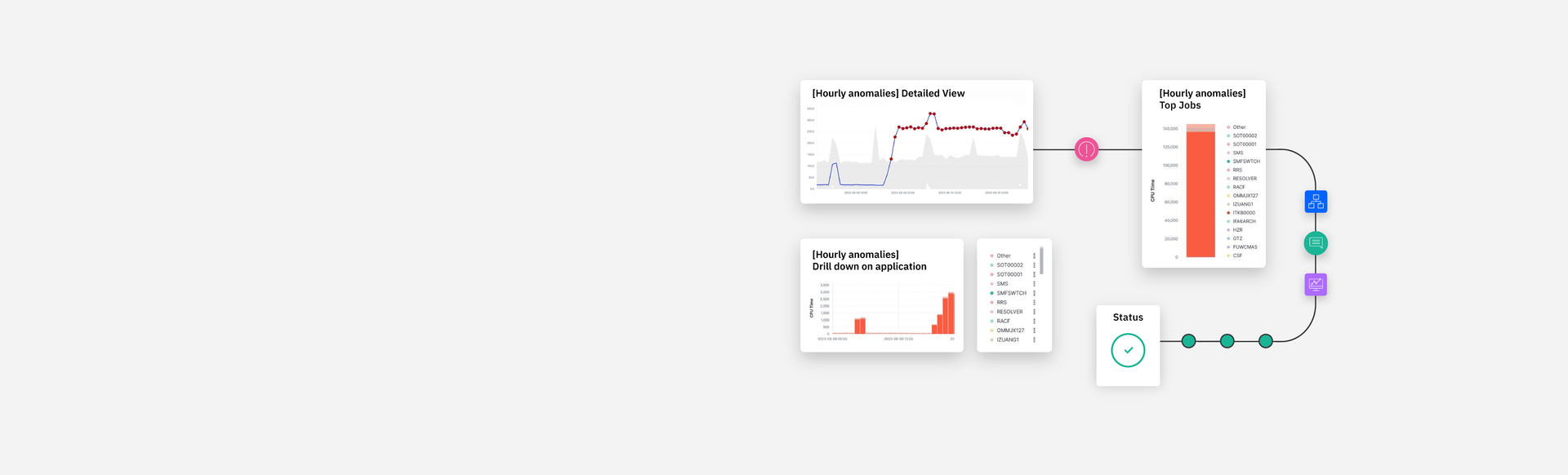
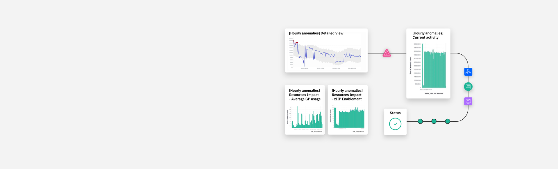
The style of illustration used on these pages is coined "hybrid-UI". This was the most important aspect of these pages, it involved gathering product screenshots from the client and assessing what the most important and visually interesting parts of the screenshots were. From there, I recreated them in a simplified and visually pleasing way to help convey what the product can do for customers. I made three different leadspaces for the three different versions of the product — this allows for consistency across the pages, but also shows a visual difference when clicking through the different pages.
LEADSPACE DESIGNS
Leadspaces are the banner image for webpages and are often the most significant image on IBM pages. These are just a few among the many that I made in my time working there. Copy and CTA's are needed on the left hand side of IBM pages, therefore, illustration and leadspace imagery often require more right-side focused designs, thus the space on the left-hand side of these examples.